Chiaroscuro
"Asphalt Storage Tanks" by Eric Rennie My SLR cameras have automatic controls that make it possible to operate them like point-and-shoot cameras so you can take pictures without fiddling with anything other than the shutter. There are situations where this feature comes in handy, particularly when you have to shoot rapidly. But if that is all you want to do, you are probably better off with a far less expensive point-and-shoot camera. You will be able to take perfectly decent photos, albeit by sacrificing the rich tonal variations that can be captured with manual controls. Painters during the Renaissance perfected a technique called chiaroscuro, an Italian word derived from the Latin “clarus,” meaning clear or bright, and “obscurus,” meaning dark or obscure. These artists could lend depth and drama to their work by bathing their subject is a strong single source of light that emphasized the contrast between light and shadow. Leonardo da Vinci is usually credited with pioneering the technique in the 15th century, with Caravaggio and Rembrandt not far behind. Rembrandt frequently made use of chiaroscuro to lend psychological depth to his many self-portraits. He produced more than 90 of them over his lifetime, including paintings, etchings and drawings – more reputedly than any other known artist. I remember seeing a late self-portrait at the Rijksmuseum in Amsterdam and being struck by its utter lack of affectation. As a younger man Rembrandt had sometimes pictured himself in historical fancy dress. There was none of that here, just a broken old man emerging from the shadows, a man old beyond his years. Rembrandt was never much to look at, and the years had not keen kind. There was a lifetime written on this face, a life in which he had suffered the loss of a wife, a mistress and three of his four children. He had been wealthy and successful in his prime but had lived beyond his means and then had fallen out of fashion. His house and possessions had been auctioned off to pay his debts. He was even obliged to sell his dead wife’s grave in Amsterdam’s Oude Kerk. Through it all Rembrandt kept painting, and the result was magnificent even in defeat – indeed, you can argue that defeat had elevated his art to a plane achieved by few other artists. Near the end of his life Oscar Wilde recalled walking as an undergraduate around the gardens at Magdalene College in Oxford. He told a friend he wanted to eat of the fruit of all the trees in the garden of the world. And so he had, never imagining that he would be made to eat such bitter fruit along with the sweet. He wrote, “My only mistake was that I confined myself so exclusively to the trees of what seemed to me the sun-lit side of the garden, and shunned the other side for its shadow and its gloom.” His downfall began with an ill-advised libel suit against the Marquis of Queensbury, who had called Wilde a sodomite for consorting with his son, Lord Alfred Douglas. The lawsuit was unsuccessful, and in short order Wilde was prosecuted and convicted for gross indecency, winding up imprisoned under harsh conditions in Reading Gaol. Why did Wilde consider it a mistake to confine himself to the sunlit side of the garden? Did he imagine he was tempting fate by shunning the darkness? His use of the word “confined” is significant. He came to recognize that far from being a negation of life, the shadows were what gave life its depth and emotional resonance. As a young student at Oxford, Wilde might be forgiven for having been drawn exclusively to the light. It served him well enough when he wrote his light-hearted comedies for London’s West End. But without the heartbreak and disgrace of his last years, he could never have written De Profundis – arguably his most powerful and affecting work – in which he gave a full accounting of his downfall. A point-and-shoot camera will automatically adjust the exposure to fill in the shadows that might otherwise gather around a picture. The result is images that are brighter and more colorful than what you actually see with the naked eye. It’s kind of like those old Hollywood movies from the 1950s, which lent a cartoonish Technicolor glow to everything. Artistic depictions of heaven suffer from the same deficiency. They are painted in primary colors, with no half tones. If they appear two-dimensional and uninspired, that is why. The genius of chiaroscuro as an artistic technique is that it does not try to separate “clarus” from “obscurus.” The two do not exist in isolation, but each sets off and accentuates the other. As to whether the light is swallowed up by the dark or emerges from it, that all depends on how one chooses to see it. True Colors
Page from Werner’s Nomenclature of Colours A bird-watcher I know complains about wildlife photographers who can’t resist using Photoshop to make the plumage of birds more colorful than it actually is. She has specifically exempted me from criticism because I am a fine arts photographer and therefore have artistic license to do whatever I want. As it happens, I do a lot of landscape work, but I am not really fast enough on the draw to photograph birds in their natural habitat. (By the time I get my camera and tripod set up, the birds would have flown south for the winter.) And while I use Photoshop and other add-ons during post-production, I am mostly concerned with making the picture as close as possible to what I saw in my mind’s eye. I use the term “mind’s eye” advisedly, because even though my perception of the subject may appear to be what I actually saw, I know it takes place in the theater of the mind. It is easy enough to make adjustments in Photoshop so that colors are more vibrant than what was captured in the raw image. The issue, both from a technical and philosophical standpoint, is what the subject’s true colors are to begin with. The question might appear at first to be fairly straightforward, like comparing color swatches at the paint store. Indeed, in the era before color photography, naturalists used color charts to make precise written descriptions of plants and animals they found in the wild. Charles Darwin, in his famous voyage aboard the HMS Beagle, made extensive use of a little handbook called Werner’s Nomenclature of Colours, published originally by German mineralogist Gottlob Werner and then updated in 1814 by a Scottish flower painter named Patrick Syme. The names the handbook attached to various swatches were often as colorful as the hues themselves: Arterial Blood Red, Asparagus Green, Skimmed Milk White, Velvet Black and Wax Yellow. Such vivid nomenclature enabled Darwin to describe the specimens he found with precision and poetry. Here, for example, is a notebook entry on a dogfish: Body “blueish grey”; above, with rather blacker tinge; beneath much white:— Its eye was the most beautiful thing I ever saw.— pupil pale “Verdegris green”, but with lustre of a jewel, appearing like a Sapphire or Beryl.— Iris pearly edge dark.— Sclerotica pearly:— In stomach was remains of large fish. When Darwin’s account of his voyage was published in 1839, one reviewer called him “a first-rate landscape-painter with the pen.” Lyricism aside, Werner’s color scheme enabled Darwin to guard against the inevitable fading of colors when specimens were shipped back to England. Darwin collected rocks, fossils, animals, and plants, and the perishable items were preserved in alcohol. Back in England, his colleague, the Reverend Leonard Jenyns, observed that the specimens were “much altered by the action of the spirits.” Naturalists often avoided problems with depicting true colors by publishing only black-and-white illustrations of their discoveries. A notable exception was John James Audubon, whose monumental Birds of America was released starting in 1828 with hand-tinted copper plates of indigenous bird species. He worked from actual birds in natural settings, but colors remained tough to get right. Audubon’s later collaborator, John Bachman, once groused that "color is as variable as the wind." The truth about true colors is there aren’t any – or at least none that remain constant. Does an object appear in light or in shadow, at dawn or midday, in winter or summer, outdoors or in – and if the latter, under incandescent or fluorescent lights? Claude Monet, the French Impressionist painter, mostly worked outdoors, where he found himself in a never-ending race against the shifting light. “Color, any color, lasts a second, sometimes three or four minutes at most,” he complained. For his series on the cathedral at Rouen, he set up his canvasses side-by-side in the window of a lingerie shop across the street, working on each in turn throughout the day as sun and shadow played across the cathedral’s stone façade. Is color the property of the object or, as Galileo asserted, does it exist only in the eye of the beholder? Monet believed he was painting light, not the objects the light fell upon. And yet in his case there is a twist that -- if you will excuse the pun -- sheds more light on the issue. As the artist grew older, he began to experience changes in his perception of color due to nuclear cataracts in both eyes. Nuclear cataracts absorb light, desaturate colors and produce a yellowish cast over everything. Monet tried to compensate by working from memory and carefully reading the labels on his paint tubes. Nevertheless, the effect of cataracts was quite pronounced on his later work, including on his magnificent water lilies. The brush strokes were bolder, the details less distinct, and the colors muddier, with a shift from greens and blues to yellows and browns. Werner’s color chart would have done little correct the misperceptions, since presumably the swatches themselves would be subject to the same cataract-induced distortions. So where then does color reside, inside of oneself or out there in the world? Science is of relatively little help here, since color as such – the redness of a rose – has no measurable existence in scientific terms. It falls into the realm philosophers refer to as qualia, those subjective, non-physical aspects of our experience produced by our senses and emotions. And yet, if there are no colors out there in the world, how do you explain the fact that you and I can agree that an asparagus stalk matches Werner’s color swatch for Asparagus Green? Surely there is something about asparagus that signals greenness to both of us. But if so, why does my color-blind son look at Werner’s Asparagus Green swatch and find it indistinguishable from brown? Clearly, color cannot be explained exclusively in terms of “in here” or “out there,” but where exactly does the boundary lie between the two? The 19th-century physicist Ernest Mach pondered this question and came to a radical conclusion. “There is no rift between the psychical and the physical, no inside and outside, no ‘sensation’ to which an external ‘thing,’ different from sensation, corresponds,” he wrote. “There is but one kind of element, out of which this supposed inside and outside are formed…” Quantum physicists later confirmed Mach’s observation. “Subject and object are one,” declared the Nobel Laureate Erwin Schrodinger. In other words, there is not one color in my mind’s eye and another adhering to an object in the world. There is only one color. Blackout
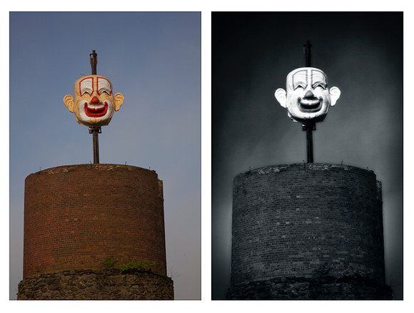
My photograph, "Clown God," above right, has been accepted in a national juried competition called "Blackout" at the Ashton Gallery in San Diego, CA. The exhibition runs from October 27, 2018 to November 17, 2018. The winning entries were selected from among 897 works of art by 324 artists. The juror was Daniel Foster, an arts administrator and former museum director, as well as a visual artist and poet. My entry is based on the raw image, above left, taken shortly after sunrise on the grounds of Will Bill's Nostalgia Emporium in Middletown, CT . Wild Bill's was the place to go if you wanted to photograph a 600-lb.clown head that ran up and down on a motorized track on top of a 33-foot brick silo. Alas, the place has closed following the death of its owner. "Clown God" was previously exhibited at the 1350 Gallery in Los Angeles and at Gallery 136-1/2 in Manchester CT.
As I See It
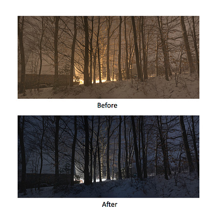
There is a widespread notion that using Photoshop or other software to adjust images after they are taken is somehow deceitful. Granted, there are deceitful uses for such digital enhancements, particularly in advertising. But I mostly use them to restore the image to what I actually see with the naked eye, rather than what the camera sees. A case in point: a photograph I took in my backyard shortly before dawn on a snowy morning. The raw image was overexposed to bring out details that would otherwise have disappeared in the darkness, and there is a yellowish cast from the lights on my neighbor’s back patio. First I adjusted the color balance to eliminate the yellowish cast and to restore the bluish tinge to the sky and snow. Then I adjusted the exposure in places to restore the scene to the way I saw it, rather than the way the camera did. So which is the truer picture? Trees
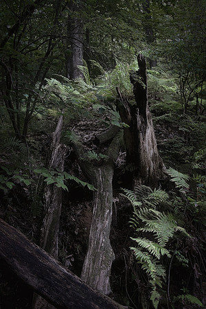
"Trees" by Eric Rennie My photograph, "Fallen," was taken in 2014, several years after an early winter storm felled many trees in a state park at the end of the street where I live in southern New England. It is one of 55 images selected by photographer and gallery owner Michael Pannier for a juried competition entitled "Trees" at the Darkroom Gallery in Essex Junction, VT. The exhibit runs from September 20, 2018 to October 28, 2018. A black-and-white version of this photograph has been exhibited elsewhere.
|