True Color
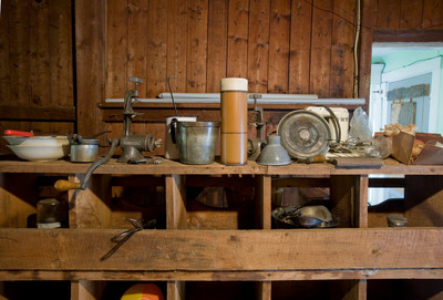
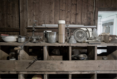
The image above as originally photographed; desaturated version below.
The George Eastman House in Rochester, NY is mounting an exhibition that commemorates the 100th anniversary this year of Technicolor film. That got me thinking about the use of color in photography – in particular, the issue of “true” color. (Technicolor itself is highly saturated, giving the world a luster that can be found nowhere else but in a Hollywood film.) The human eye does not perceive color the way it appears on screen or in a photograph. Different films and digital cameras operate within their own color ranges. The eye tends to adjust for color shifts caused by changes in lighting, so that a white object always appears white. However, a camera will pick up shifts in color balance caused by changes in natural or artificial light. For example, an outdoor scene may have a golden hue at sunrise or sunset that disappears at midday. Similarly, a white wall might appear yellow in incandescent light and blue in florescent light. So what, then, is the true color? Many masters of the black-and-white medium like Ansel Adams found color to be a distraction, although Adams did experiment with it. My digital photograph at top illustrates the problem. The green hallway at right, bright red-handled implement in the bowl at left, and yellow-and-orange object below all pull the eye in different directions away from the center of the photograph. I might have solved the problem altogether by eliminating color and working in black and white. Alternately, I could have reduced the color vibrancy of the image’s distracting elements, which retaining the rich saturation of the wooden shelves and walls. Instead, I chose to desaturate the color of the entire image to give it old-time look in keeping with many of the objects on display here. |
Archive
January
February
March
April
May
June
July
August
September
October
November
December
|